{
    "type": "text",
    "name": "title",
    "label": "Title",
    "placeholder": "Enter a title...", // optional
    "default": "Buy Now", // optional
    "required": true, // optional
    "help": "help text shown in tooltip to creator while editing", // optional
    "dependencies": [
      {
          "field": "dependent_field",
          "value": "dependent_value" //optional
      }
    ] // optional
  }
  {
    "settings": {
      "title": "My Amazing Email Campaign"
      // ...additional plugin settings
    }
    // ...plugin-specific additional data
  }
Plugin component library
Text input
  {
    "type": "text",
    "name": "title",
    "label": "Title",
    "placeholder": "Enter a title...", // optional
    "default": "Buy Now", // optional
    "required": true, // optional
    "help": "help text shown in tooltip to creator while editing", // optional
    "dependencies": [
      {
          "field": "dependent_field",
          "value": "dependent_value" //optional
      }
    ] // optional
  }
  {
    "settings": {
      "title": "My Amazing Email Campaign"
      // ...additional plugin settings
    }
    // ...plugin-specific additional data
  }
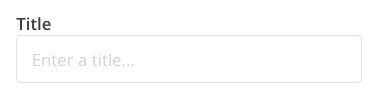
The text input allows creators to enter short snippets of text in a single-line field. It’s perfect for collecting titles, names, URLs, or any brief text content that doesn’t require multiple lines. The input provides a clean, straightforward interface for essential text-based information.
Compatibility
Plugin type
Availability
Additional notes
Content blocks
Media source
Available as part of the preset search functionality. Check media source documentation for more details.
Properties
string
required
text - the type of the component
string
required
A unique internal-only identifier that is posted to an app’s plugin server to share values inputted by the creator
string
required
Creator-facing identifier that is shown in the plugin environment
string
Placeholder text displayed in the input field when empty
string
Default text value that is pre-filled when the component first loads
boolean
Determines whether the creator must enter text before proceeding
string
Brief creator-facing explanation that clarifies the component’s purpose and usage. (256 character limit. Supports markdown: [text](url), **bold**, and *italic*)
object array
Allows for the field to be shown conditionally. dependent on other fields. See dependencies page for more details.
Show properties
string
required
Name of the dependent field
string
Value for the dependent field required to show this field. To show when any value is inputted, leave out this property.
  {
    "type": "text",
    "name": "title",
    "label": "Title",
    "placeholder": "Enter a title...", // optional
    "default": "Buy Now", // optional
    "required": true, // optional
    "help": "help text shown in tooltip to creator while editing", // optional
    "dependencies": [
      {
          "field": "dependent_field",
          "value": "dependent_value" //optional
      }
    ] // optional
  }
  {
    "settings": {
      "title": "My Amazing Email Campaign"
      // ...additional plugin settings
    }
    // ...plugin-specific additional data
  }
Was this page helpful?
Assistant
Responses are generated using AI and may contain mistakes.